Welcome back to The Art of Caesura!
One of my hobby goals for this year is to submit photos of my dudes to White Dwarf. To do that I realized that I would have to re-photograph my stuff - they ask for a plain white background. Anyway, all this got me thinking that someone out there might find it helpful to know how I photograph my miniatures. Well fasten your seat belt, 'cause you're about to find out!
When I was first thinking about photographing minis for my blog there were a few practicalities that I considered:
Accessibility:
I wanted my set up to be:
Brand Recognition:
From the beginning I knew that I wanted my photos to be instantly recognizable. If people saw my photos posted or re-posted somewhere else (like pintrest, instagram, facebook, TGA Community, or Cool Mini or Not) they would know "oh, that's that Caesura guy" or at least think "oh that's that guy who takes photos of his stuff on that nice piece of wood against a dark background."
Before I thought to stick a logo on my photos, I knew that to personalize them, I could just consistently take photos in a bit of a unique style.
There are tons of people who create a recognizable style with their photos, one who pops to mind would be: theempyrean_
Stylish:
Even more important than having my photos be recognizable is for the photography to have style, and a style that complements the kinds of models I like to paint.
Actually Taking the Pictures!
Hilariously, for an article on taking photos of minis, I'm not actually going to go into the actual taking of the photos. Games Workshop has an excellent article on this here. My purpose here is to tell you about how and why I try to make the photos look mine.
Post-Production:
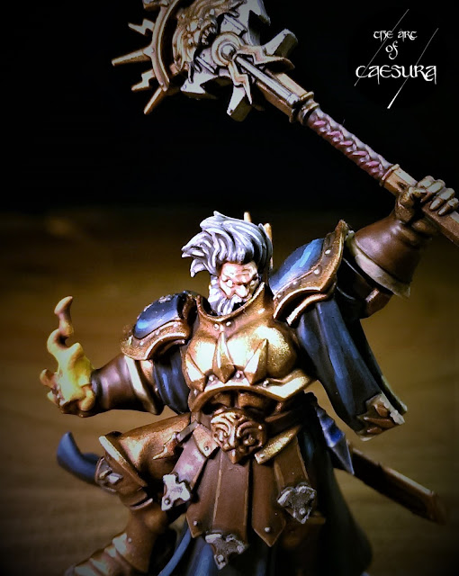
I have never seen photo editing as "cheating", I see it as trying to get the most out of the equipment I have to make the model look as much like it does in real life as possible. My photo equipment is modest at best (a 5 year old HTC One M7 phone, and two incandescent lights), so it needs a bit of help in post-production.
My post-production process starts in Microsoft Photo with cropping the image. Sometimes this helps remove the glow from one of the lamps or an errant finger in the frame, but more often it just centres the picture nicely.
Next, I change the values a little. I bring the warmth down to compensate for the incandescent bulbs.
Then I apply a vignette effect to the borders. Again, this helps to reduce the lamp glow, but it's more just a stylistic thing to make my photos look dark, moody, old-timey, and in my opinion, a bit more interesting.
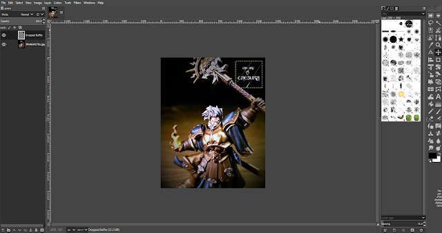
Once the photo is done, I apply my logo using Gimp (basically a free version of Photoshop) (you can read all about the idea behind my logo here). As you have likely seen, I have two versions of my logo: the main one, and the one I use for work-in-progress shots.
The only other program I use is IrfanView-64 and I use it solely for my CMoN photos, to make vertical panoramas and resize them. I'm sure I could do this in Gimp, but I'm a simple lad and find it much easier just to do it here.
And that's it! You are now privy to all the inner workings of The Art of Caesura! If you have any questions or tips please get it touch in the comments below!
Reading: Spawn #291
Next Week:
Into the Underworlds...
One of my hobby goals for this year is to submit photos of my dudes to White Dwarf. To do that I realized that I would have to re-photograph my stuff - they ask for a plain white background. Anyway, all this got me thinking that someone out there might find it helpful to know how I photograph my miniatures. Well fasten your seat belt, 'cause you're about to find out!
When I was first thinking about photographing minis for my blog there were a few practicalities that I considered:
Accessibility:
I wanted my set up to be:
- Cheap: using only equipment / programs that I already had or were freely available.
- Quick: to set up and take down - the main part of the hobby for me is the painting, so I didn't want the photography to be a huge production that took loads of time away from painting. Also, we don't have a ton of room in our house, so I didn't want a set up that would be onerous to disassemble / stow away.
- Portable: I move around a lot for work, I've already moved house twice since starting the blog, and with another move soon approaching, I wanted my set-up to be basic and easy to bring with me.
Brand Recognition:
From the beginning I knew that I wanted my photos to be instantly recognizable. If people saw my photos posted or re-posted somewhere else (like pintrest, instagram, facebook, TGA Community, or Cool Mini or Not) they would know "oh, that's that Caesura guy" or at least think "oh that's that guy who takes photos of his stuff on that nice piece of wood against a dark background."
Before I thought to stick a logo on my photos, I knew that to personalize them, I could just consistently take photos in a bit of a unique style.
There are tons of people who create a recognizable style with their photos, one who pops to mind would be: theempyrean_
Stylish:
Even more important than having my photos be recognizable is for the photography to have style, and a style that complements the kinds of models I like to paint.
Actually Taking the Pictures!
Hilariously, for an article on taking photos of minis, I'm not actually going to go into the actual taking of the photos. Games Workshop has an excellent article on this here. My purpose here is to tell you about how and why I try to make the photos look mine.
Post-Production:
I have never seen photo editing as "cheating", I see it as trying to get the most out of the equipment I have to make the model look as much like it does in real life as possible. My photo equipment is modest at best (a 5 year old HTC One M7 phone, and two incandescent lights), so it needs a bit of help in post-production.
My post-production process starts in Microsoft Photo with cropping the image. Sometimes this helps remove the glow from one of the lamps or an errant finger in the frame, but more often it just centres the picture nicely.
Next, I change the values a little. I bring the warmth down to compensate for the incandescent bulbs.
Once the photo is done, I apply my logo using Gimp (basically a free version of Photoshop) (you can read all about the idea behind my logo here). As you have likely seen, I have two versions of my logo: the main one, and the one I use for work-in-progress shots.
The only other program I use is IrfanView-64 and I use it solely for my CMoN photos, to make vertical panoramas and resize them. I'm sure I could do this in Gimp, but I'm a simple lad and find it much easier just to do it here.
Reading: Spawn #291
Next Week:
Into the Underworlds...


Comments
Post a Comment
Tell me all...