Able to smash, crash and bash
through even the toughest opponents,
Ogres provide Human teams with that
touch of utter brutality sometimes
missing from their rosters.
- Games Workshop
Welcome back sports fans to another Blood Bowl post on The Art of Caesura!
This week we're adding a bit of muscle (read: giant slab of meat) to my Human Blood Bowl team in the form of an ogre!
To get up to speed on my human team, here are the work-in-progress shots, and last week we looked at the completed team in all its glory.
Having just completed this post, it evolved into rather a deep dive into painting faces; I hope you find it helpful let me know in the comments below!
Now, on to this big bruiser!
Next came the eyes. I usually save details 'till the end, but if I'm going to do eyes, I like to do them at this step (after having applied the shade to the face). By waiting until after the shade stage, the eye sockets are nicely darkened and outlined. Some people start the eye by painting the whole eyeball black to provide a strong outline before applying the white, but I haven't had much success with that method, so this is my compromise. I also like to do the eyes before I've done any highlighting on the face, because it's much easier to paint over whoopsies now than it is once I've been mixing loads of thin highlight glazes.
So I actually used Ushabti Bone for his sclerae rather than white. I felt this would look more natural at the larger scale than pure white, and it would also give me the opportunity to differentiate the "reflection point" - which I'll go into in a minute.
After the eyes, I moved onto the rest of the face. Without meaning to be too self-laudatory, I'd recommend you check out this post at this stage. While ostensibly a review of Scale 75's fleshtones, I do talk a bit about some of the theory behind painting skin. I will reproduce an important quote that I shared on that post:
The complexion of a light-skinned face divides into three zones:
The forehead has a light golden colour because it's freer of muscles and surface capillaries.
The ears, cheeks and nose all lie within the central zone of the face.
Those areas have more capillaries carrying oxygenated blood near the
surface, causing the reddish colour...
The zone from the nose to the chin (where there are relatively more veins carrying blue deoxygenated blood) tends toward a bluish, greenish or greyish colour. Some artists accentuated this subtle bluish or greenish hue to bring out the reddish lip colour.
Color and Light (page 156) - James Gurney
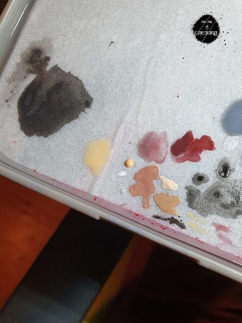
With the above observations in mind, I began glazing across the nose and cheeks with Indian Shadow. To glaze, I put a drop of lahmian medium with the back end of my brush on my palette and then added a tiny speck of Indian Shadow with the tip of my brush. This gave the desired "skim milk" consistency. I repeated this glaze 3 times to build up the ruddy tone.
I finished off the face by painting the teeth Ushabti -> Agrax -> Ushabti, the lips with a few thinned coats of African Shadow with highlight texture lines of 1:1 African Shadow : Pale Skin. The ear and lip rings were Leadbelcher -> Nuln Oil -> Stormhost Silver.
Geeze, this is turning into a long post, sorry about that, but I got really into talking about painting faces. Go figure!
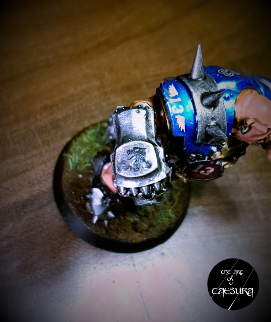
Before I go, I just want to point out the last detail: I added one of the griffon head decals to his punching fist. I kept it subtle by applying it before adding the Nuln Oil and then scuffing it with lightly drybrushed Stormhost Silver.
We'll be talking more about decals in a couple of weeks, and we'll be getting a better look at this guy next week so tune in then right here on The Art of Caesura!
Reading: The Porpoise - Mark Haddon
Gaming: Rage 2 - Id Software
Next Week:
Big is beautiful...
through even the toughest opponents,
Ogres provide Human teams with that
touch of utter brutality sometimes
missing from their rosters.
- Games Workshop
Welcome back sports fans to another Blood Bowl post on The Art of Caesura!
This week we're adding a bit of muscle (read: giant slab of meat) to my Human Blood Bowl team in the form of an ogre!
To get up to speed on my human team, here are the work-in-progress shots, and last week we looked at the completed team in all its glory.
Having just completed this post, it evolved into rather a deep dive into painting faces; I hope you find it helpful let me know in the comments below!
Now, on to this big bruiser!
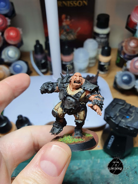
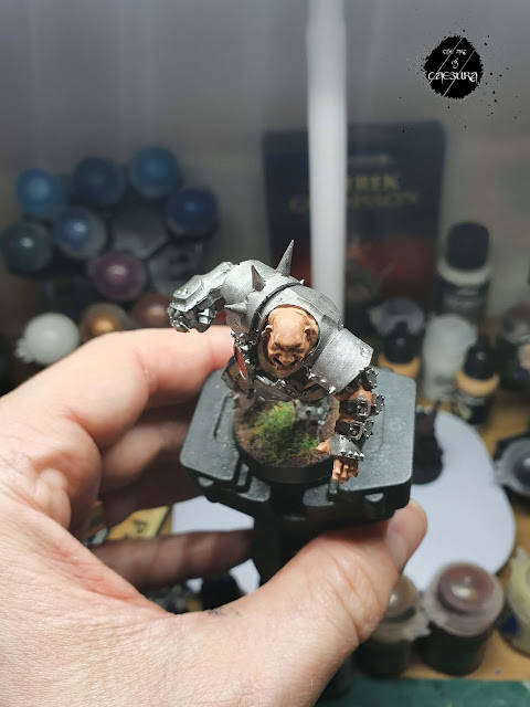
I started him at the same time as the rest of the team and undercoated him, and fully painted his undersuit in this manner. Once I began the metal, however, I found that he was different enough to kind of mess up the conveyor belt I had going with the rest of the players, so I set him aside to devote proper time to him once I had the rest of the team done.
My general painting process for this team is detailed here, so I'll focus on the things that were a bit different on this guy. If you have any questions at all be sure to leave them in the comments below.
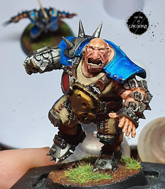
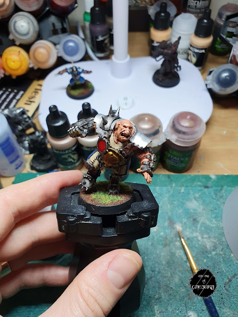
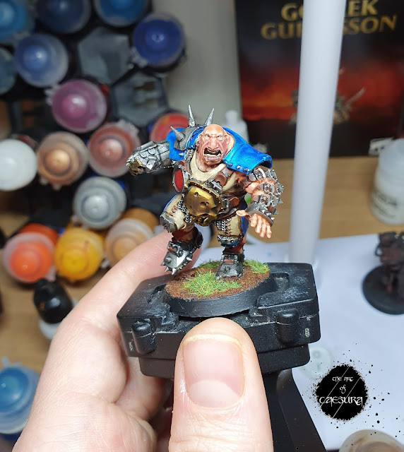
I'll start with his belly armour. I started by painting it like the brass on my regular players (on the trim and crests of the Blitzers). While this had worked well on the small areas of the human players, it looked too yellow and gaudy on the large surface on the ogre. I remedied this by giving it two light drybrushes of Stormhost Silver to de-saturate the yellow a bit.
The blue armour panels also worked differently on this larger scale model. While the idea was the same (painting Contrast Talassar Blue over Stormhost Silver), I put a lot more care in to the execution. I found that because the armour panels were so much bigger on this guy, if I just globbed a big bit of the blue on a panel and spread it around (as I had done on the smaller guys) it would build up too much at the edges. So I actually still didn't thin the coats, but I was just much more intentional in my application of the blue, being quick to move it around if it was pooling while trying not to cause streaking.
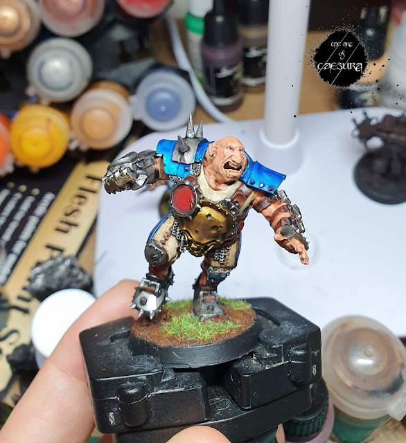
The bit I want to focus on with this guy is the bit I'm most proud of: his face. With such a large face, I delighted in the opportunity to really go to town. I did all of the things that I would like to do on smaller faces, but don't always devote the time it would take.
I started by applying a few thinned layers of Cadian Fleshtone to have a nice base to work from. Then, instead of using Scale 75's Basic Flesh + Pale Flesh to go over the whole thing, as I usually do, I mixed S75's Basic Flesh + Golden Flesh to change the skin tone. I wanted his skin tone to be a little more reminiscent of the Warhammer Fantasy Battle ogres of olde who had Mongolian influences. I also did this to diversify him from the rest of my players - to show that he is a different being altogether and not just a 'big human'.
With this nice warm skin tone laid down, I washed with 5:1 Contrast Medium : Guilliman Flesh. This was the same process as on my humans and I found it worked really well.
So I actually used Ushabti Bone for his sclerae rather than white. I felt this would look more natural at the larger scale than pure white, and it would also give me the opportunity to differentiate the "reflection point" - which I'll go into in a minute.
Then the pupil. My advice here is just do your best. Again the reason I do the eyes at this early stage of the face is that mistakes aren't a big deal. I find the best eyes I've done started out looking like gormless stares with the sclera spilling over on to the eyelids (and sometimes even the eyebrow!). But, once you clean it all up by carefully painting the skintone and directed shade over the errant white brushstrokes (and going back and forth between re-painting the skin and re-painting the sclera / pupil) it really comes together. On this model the eyes were big enough to finish with a dot of pure white in each one to show the reflection. This really gives life to eyes, but I'm rarely ballsy enough to do it.
The complexion of a light-skinned face divides into three zones:
The forehead has a light golden colour because it's freer of muscles and surface capillaries.
The ears, cheeks and nose all lie within the central zone of the face.
Those areas have more capillaries carrying oxygenated blood near the
surface, causing the reddish colour...
The zone from the nose to the chin (where there are relatively more veins carrying blue deoxygenated blood) tends toward a bluish, greenish or greyish colour. Some artists accentuated this subtle bluish or greenish hue to bring out the reddish lip colour.
Color and Light (page 156) - James Gurney
With the above observations in mind, I began glazing across the nose and cheeks with Indian Shadow. To glaze, I put a drop of lahmian medium with the back end of my brush on my palette and then added a tiny speck of Indian Shadow with the tip of my brush. This gave the desired "skim milk" consistency. I repeated this glaze 3 times to build up the ruddy tone.
Next I glazed the lower half of his face - from his (surprisingly prominent) cheek-bones down - with a glaze I made from Indian Shadow desaturated by adding a bit of black and white (you could use a neutral grey for this, I just don't happen to have one).
It becomes important to highlight each third of the face differently and the easiest way I have found is by adding a bit of Pale Skin into the colours used to make the glazes (this is where wet palettes really come into their own!).
I highlighted the upper third of the face (above the cheeks) with Golden Skin mixed with Pale Skin and diluted with Lahmian Medium. For the middle third of the face I used Indian Shadow + Pale Skin + Lahmian Medium and the lower third saw Pale Skin added to my African Shadow + black + white mix.
Be patient with this step. It looks so much better if you build up the glazed highlights slowly over multiple steps. Another useful piece of advice at this stage is for subsequent highlight layers do not add more Pale Skin for each layer just continue to use the same glaze for several layers - only applying it more and more sparingly to the predominances with each subsequent layer - before considering adding more Pale Skin.
I finished off the face by painting the teeth Ushabti -> Agrax -> Ushabti, the lips with a few thinned coats of African Shadow with highlight texture lines of 1:1 African Shadow : Pale Skin. The ear and lip rings were Leadbelcher -> Nuln Oil -> Stormhost Silver.
Geeze, this is turning into a long post, sorry about that, but I got really into talking about painting faces. Go figure!
We'll be talking more about decals in a couple of weeks, and we'll be getting a better look at this guy next week so tune in then right here on The Art of Caesura!
Reading: The Porpoise - Mark Haddon
Gaming: Rage 2 - Id Software
Next Week:
Big is beautiful...








Nice work!
ReplyDeleteHey, thanks very much!
Delete