
Gray is the colour of all theory.
- Johann Wolfgang von Goethe
Hello all and welcome to your weekly dose of The Art of Caesura!
Last week, I excitedly gave you an overview of the first ever miniature painting course that I have taken, which was taught by the esteemed Marco Frisoni.
Marco filled our minds with applicable art theory, and one of the concepts that I want to delve deeper into today, is that of value sketching.
First let us define some terms:
Firstly what do we mean by value? Here's a helpful definition:
Value refers to the lightness or darkness of a color. It defines a color in terms of how close it is to white or black. The lighter the color, the closer it is to white. The darker the color, the closer it is to black. For example, navy blue emits less light and has a lower value than sky blue.

Here's a fun example of what value enables us to do in art. All the circles above are grey and flat (they're on your flat computer / phone screen after all) the two on the right use changes in value (darker on the left, lighter on the right) to appear 3D. The right-most sphere (circle) uses value again to give an impression of its surroundings (it looks like it's sitting on a surface).
So, pertinent to miniature painting, value accentuates three dimensionality and can make suggestions about the environment - we will explore this in more depth in a moment.
And what about "sketch"?:
Sketching simply means concentrating on only one or two aspects of your piece at one time.
So rather than trying to just paint the whole piece at once, you might start by focusing on the lighting or a colour that you want to convey.
Now that we're all on the same page, let's talk about how all this relates to miniature painting.
Contrast
So, when we're painting miniatures one of the most important aspects that you'll hear experienced painters bang on and on about is contrast. Just solicit genuine feedback from a good painter friend or better yet, submit something to Vincey V for his monthly painting review and you're sure to hear that to improve a paint job you should bump up the contrast. Vince even encourages reviewees to submit a picture of their miniature in black and white to better appreciate the value contrast. Another way that I've heard this is that when you think you are finished highlighting, you should keep going for a few more.
Why do we care so much about contrast? Because we are painting 32mm miniatures as if they were 6-foot tall people so to make the miniatures "read" better we need to increase contrast to accentuate detail. Also, contrast increases visual interest; think about how many of the built-in filters for pictures on your phone basically just increase contrast to make the pictures look "better".
Contrast can be achieved by many other ways than simply focusing on colour value, but that is our topic for today, so we'll think about other forms of contrast another day.
The Value Sketch
We now have an understanding about value and the importance of contrast, so we can start to see how these come together in the value sketch. By using only white paint over a black base coat (and thinning it to create a grey scale) we can really focus on the values of the miniature and maximize the contrast (you cannot get more contrasting values than pure black and pure white). This is the key purpose of the value sketch; you will often hear Vincy V. refer to values in numbers (1 being pure black, 10 being pure white) so he is often commenting that many paint jobs exist in the 4-6 range which does not have enough contrast for what we are trying to achieve. With the value sketch, we can focus only on the light intensity (creating brilliant contrast) without confusing things with hue. This takes colour out of the equation completely.
-~-
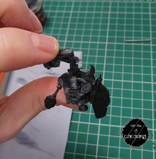
Let us turn our attention to the miniature that I painted for Marco's course by way of an example. I wanted this guy to be lit from below by an eerie toxic green glow from the swamp in which he stands. This meant that my light source (and thus my higher values) would be coming from below.

Ignoring the weapon and shield (which will be metallic and so the sketch would not show through), you can see that just building up with thin layers of white, you can get an idea of the atmosphere of the composition.

Above, you can see that viewed from below almost every surface you see should be illuminated, but that this effect should get weaker and weaker as you move away from the light source (his feet).
Contrastingly, when viewed from above (in the picture below), he is only being lit by the pale moonlight and so these surfaces are much dimmer.
The same pattern holds true for his back.


Below you can see my finished value sketch.


So now that we have our finished value sketch, what was the point if we're just going to paint over it? Well the next step would be to paint over our value sketch using highly translucent paints (glazes) (Contrast Paints, for example - though the effect can be achieved with most any paint + mediums and thinners) this way the value sketch defines the values of the colours that get added.
Say, for example I coated this whole dude in an even layer of Plaguebearer Flesh (a translucent yellow-green Contrast Paint); you can see how the Plaguebearer would naturally look lighter (higher value) over the white areas and darker (lower value) over the grey and black areas. This is the power of the value sketch. However, once you begin to apply translucent paint over your value sketch, you will automatically knock back some of the contrast (even the lightest yellow isn't as high value as pure white) so you want to "overdo" your value sketch a bit - making each element one value lighter than what you intend for the completed model.
-~-
For fun (and for my own reference) I took a picture of Marco's work-in-progress value sketch of his miniature lit from above and from the front to show the difference in atmosphere between our two pieces.


You can see that applying colour to his model would have a very different effect than on mine, simply due to the value sketch.
-~-
I hope that this has been helpful to you. I fully confess that I am still digesting this technique, so if anything was unclear please let me know in the comments below and I will endeavour to extrapolate.
Thanks as always for tuning into The Art of Caesura!
Reading: Red Seas Under Red Skies - Scott Lynch
Next Week:
Colour!
Comments
Post a Comment
Tell me all...