
Masters of the corpse orchards,
the Lords of Blights are responsible for creating
the blessed death’s heads.
These projectiles are doled out to their Rotbringers,
and hurled at the foe
to spread the plagues festering within.
- Games Workshop
Welcome back to your weekly respite here on The Art of Caesura!
Today we are going to continue our look at a very special model. It is of the Lord of Blights that I painted at Marco Frisoni's workshop a few weeks ago. And I have to say, I think I really levelled-up painting this guy!

If you're just joining us, I attended my first painting course recently, which you can read about here.
Last week I showed you the first stage of painting this guy - the value sketch. So today we'll look at adding the haunting and toxic colours.

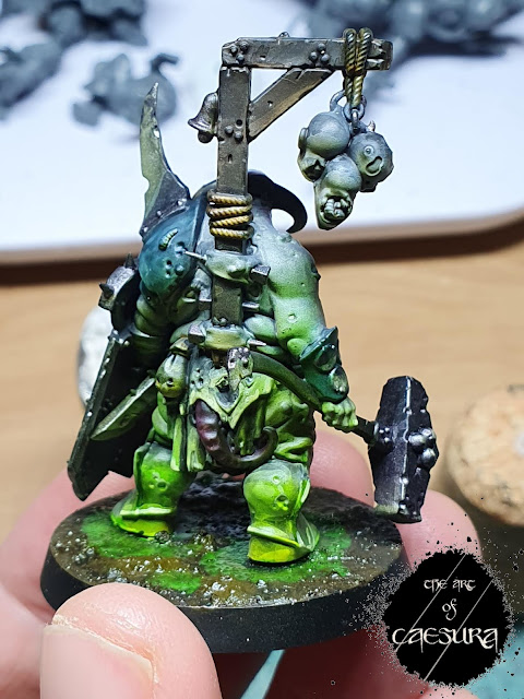
Once I had my value sketch in place (see last week), it was time to start adding colour. Before working on the OSL effect, I blocked in the "local" colours; these are the colours that would actually exist on him regardless of lighting. The important part of this was that the colours be translucent so as to allow the value sketch to influence their lightness and darkness. So I painted his armour a desaturated teal, his skin a necrotic pink-grey, his leather bands and gallows with thinned Contrast Wyldwood, and his rags a thinned warm brown.

Knowing that I wanted him to be lit by the toxic green glow of the swamp from beneath, I then launched into this eerie tone. I used Contrast Plaguebearer Flesh for the more subtle green areas (on his upper body) and mixed in this guy:

...for some real pop!

By the end of the two-day workshop that's as far as I had gotten (the two pictures above) and immediately above you can see my palette from the second day alone.
But I came away bursting with enthusiasm to keep working on him, so when I got home I continued to push the contrast - highlighting smaller and smaller areas to be brighter and brighter and the shadows to be deeper and deeper, all the while trying to not totally obliterate the local colours but still selling the environmental effects.

This style was unlike anything I had ever painted before. Having two such diverse light sources was actually a great deal of fun to emulate. All downward-facing surfaces should look green and everything from above his circumference (the bulge of his belly) should be a paler lavender colour. The maggots were particularly fun as some of them are green on one side and lavender on the other.

I started working on the metallic aspects trying to control the light and shadow by controlling lustre. Marco pointed out that metal in shadow doesn't look reflective at all, and yet we paint all of our metal bits with metallic paints. So he recommends that when shading metallics, you actually colour-match with a standard (non-metallic) paint and glaze this on in the shadows. To highlight the metals, it is important to add in the environmental colours to your metallic paints (green and lavender for me) to really sell the effect.
You can see this in action on the metal rim of his shield and the faces of his hammer. The upward facing surfaces of the hammer are tinted lavender while the downward facing surfaces are green-tinted.
Like all other highlights and shadows on the model these need continuous refining to maximize value contrast to pure silver (white for non-metallic areas) at the lightest points.

At this point I was happy with the direction that the painting was going, but the quick stand-in base that I had whipped up was detracting from my ability to know how bright to go with the highlights, so I decided to get to work on the base.

I clipped some small roots out of a dirt mound on our property; I have learned that real roots actually look more in scale as trees than real branches do.

I then quickly painted the whole thing black before trying my hand at one of my first ever attempts at air-brushing (using the cheap crappy (but perfectly serviceable for my purposes) one you can get off Wish). I sprayed the areas of the swamp that would be toxic green, first with white then yellow then that fluorescent green.


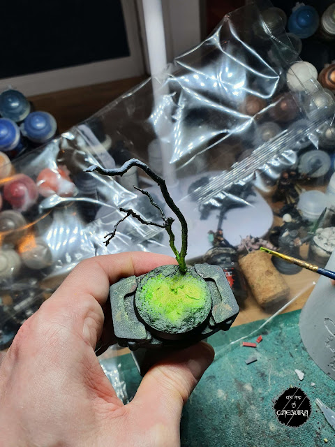
I made sure to spray the upper surfaces of the "tree" with the white - as I would be tinting these lavender for the moonlight. I also controlled some overspray onto the base of the tree to show the toxic swamp illuminating it too.

NOW WE'RE COOKIN' WITH GAS!!

I re-attached him to his base and added some gloops of gloss varnish mixed with the fluorescent green for toxic puddles. With all of this in place, it was easier to see where to go brighter with the highlights.

And here he is: the completed Lord of Blights!!
Thank you for joining me through this process. Next week we'll reward ourselves with a nice long self-indulgent look at this finished guy under cool moody lighting!
Reading: Snow Crash - Neal Stephenson
Watching: Space Force - Season 2
Next Week:
Feelin' plaguey...
Comments
Post a Comment
Tell me all...